Purple Puppet is one of the top character focused service studios in the industry. It was founded in 2015 by Riham Toulan and Frederic Lierman who both are industry veterans in the games and cg industry. Their headquarters are located in the historic city of Bruges, Belgium.
So Fred reached me out, and I was hired by the company a new logotype, and also draw some illustrations related to their updated brand to expand it and create a near-brand microculture. He said that they are big fans of their actual mascot, but asked to refresh it a little, colorize, and also make a more playful Logotype.
So Fred reached me out, and I was hired by the company a new logotype, and also draw some illustrations related to their updated brand to expand it and create a near-brand microculture. He said that they are big fans of their actual mascot, but asked to refresh it a little, colorize, and also make a more playful Logotype.
The problem with the old Logotype — a typeset font without customization. The presence of many identical letters P greatly emphasizes this problem. Due to its square shape, it was not very suitable for the main carrier (the site header). Therefore, I made a 100% custom and more horizontally aligned Logotype.
For the Mascot, Fred said that they are 90% happy with their old one, and I agree, that it was very well drawn. But I thought it was necessary to make some lines more logical, workout the randomized Bézier curves, reduce the amount of points and basically bring the picture to a common denominator.
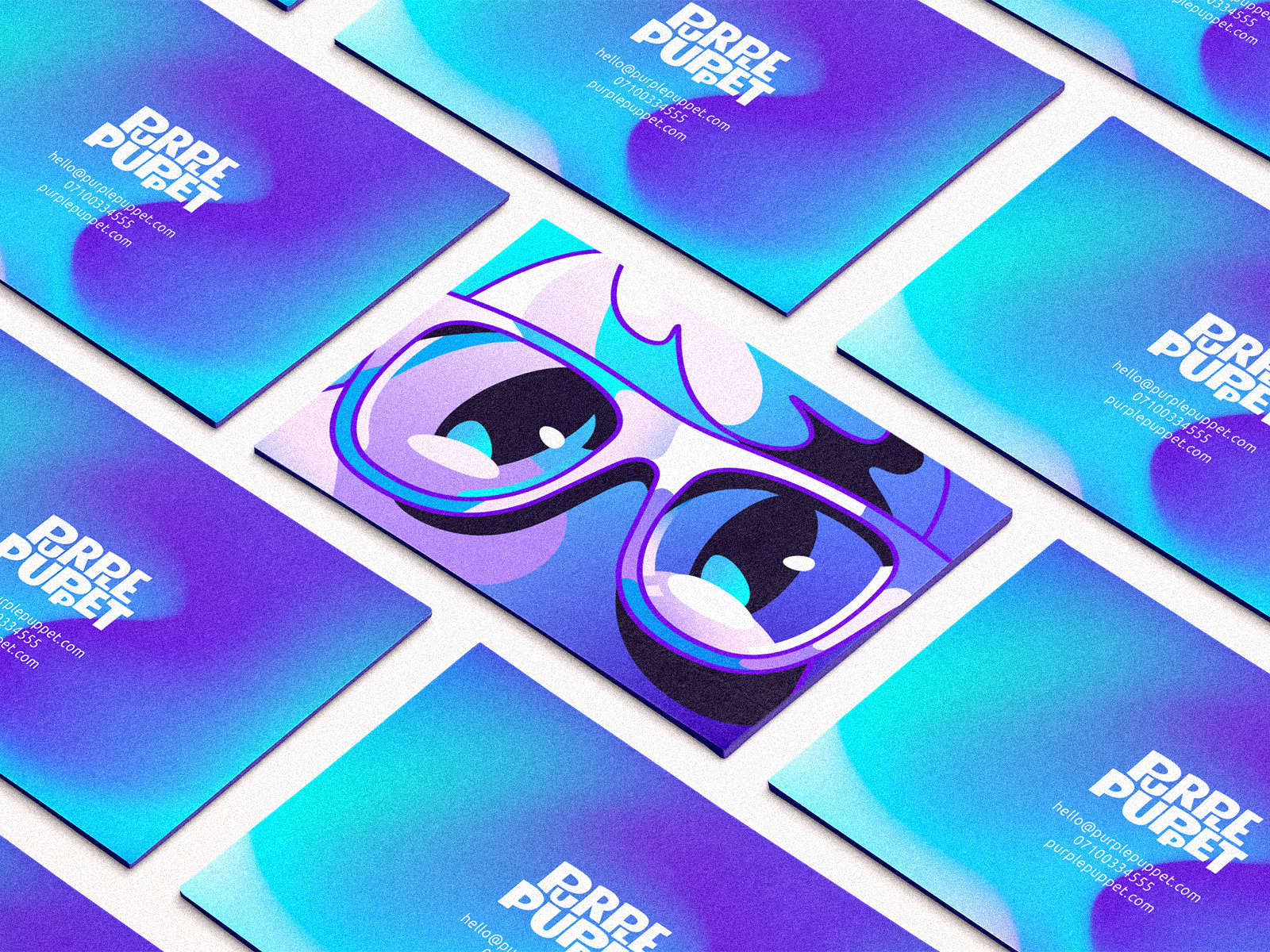
As a part of an updated identity and a way to diversify it a bit, I also designed a full color mascot for various media such as business cards, website, clothing, etc.

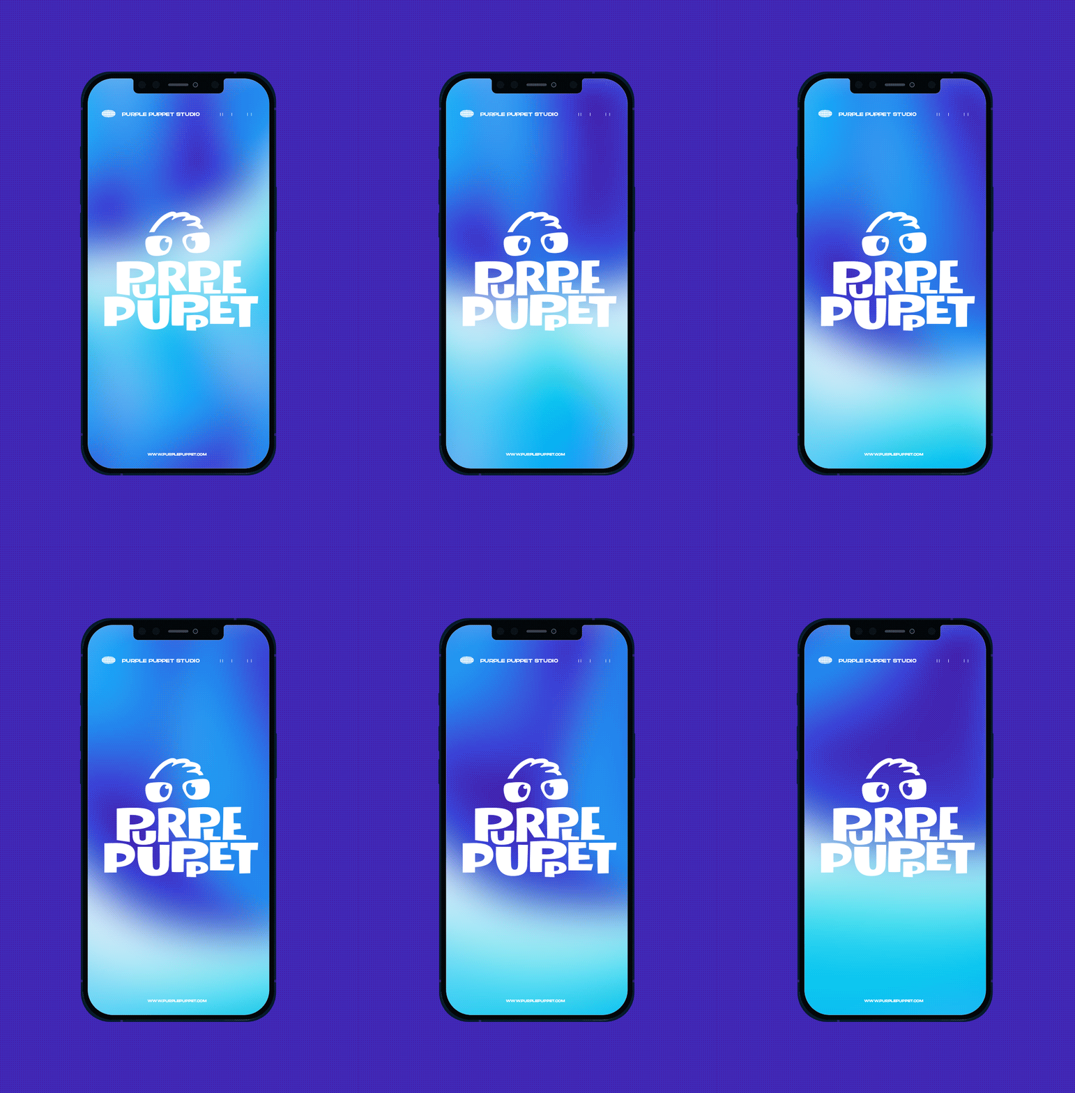
colorful background animation and logotype on it

logotype and mascot illustration on a business cards
Thank you for watching!
Feel free to contact me at dlanidd@gmail.com or via my website form
Here are my other socials